After looking at Web Applications On The iPod Touch, I thought I'd share some of the patterns used in designing an application for a 320 pixel x 240 pixel Windows CE 5 device. These same design patterns and apply to designing for the iPod Touch and the iPhone as well.
Minimum Touch Sizes
The main goal was to replace the need for the mobile stylus (which was constantly getting lost, even though it was tied to the device) with a layout that worked well with just using fingers and touching the screen. In order to establish a proper size for the layout, I needed to determine what is the smallest acceptable size that worked well. I used my thumbs for these tests, figuring if I could hit the target size icons correctly with my thumbs, even users with large fingers would be able to use the device well.
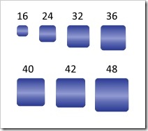
fig 1: Touch grid sizes used for testing.
After several experiments, I came to a list of acceptable sizes. The smaller sizes work well only if there is a significant amount of spacing or gutter area around the icon.
- 32 pixels by 32 pixels
- 36 pixels by 36 pixels
- 42 pixels by 42 pixels
- 48 pixels by 48 pixels
Mobile 240 Grid Designs
Nathan Smith published a 960 grid system layout. The mobile layouts were developed in 2005 long before Nathan publish his grid notes, but I believe his grid system layout helps explain the solution I used in creating layouts for the mobile device.
There are two basic column layouts that seemed to fit the available space.
- Four columns, each 40 pixels wide with a 10 pixel gutter on each side.
- Three columns, each 48 pixels wide with a 20 pixel gutter on each side.
The four column grid works well for rows of information with icons or responses on the same row. The three column grid works well for arrays of icons listed in the grid.
A Microsoft Expression 2 design template is available for download: 240 Mobile Expression Template Zip file.
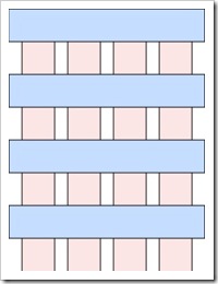
fig 2: Four Column Grid
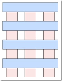
fig 3: Three Column Grid
The lower portion of the CE device display area is occupied by the status and "start" bar as well as the "keyboard" toggle icon. This leaves a usable area for design of 240 pixels wide by 284 pixels tall for the application. The iPod Touch and iPhone have a larger vertical usable area at the same viewport setting. Primarily because there is no status area on the Apple device.
After putting a header row of icons for quick access and a row of scrolling icons on the footer, that leaves room for about six icons.
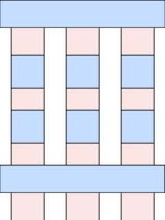
fig 4 Six icon mini grid.
The space on the windows CE device doesn't work into an even multiple of a grid and the remaining space can be utilized for date/time and breadcrumb information. The layout with six icons and the breadcrumb areas looks like figure 5.
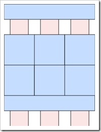
fig 5: Six icon grid.
Figure 6 shown below is similar to the header row and figure 2 with the 4 column grid and rows or bars combined with icons and text.
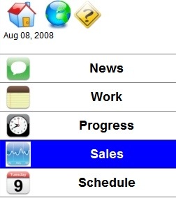
fig 6: Six Grid

fig 7: iPod and iPhone Home Layout.
I've shown in figure 7 an screen shot of the iPhone home screen for comparison. The text label on the icon on the iPhone is extremely small. This works on the iPod Touch and the iPhone because the screen brightness and contrast ration is extremely high. The windows CE device I used had extremely low contrast and screen brightness making small text and small images difficult to read.
From a contrast / usability perspective, I much prefer the iPod Touch and iPhone over the Windows CE device. Primarily because the iPod Touch / iPhone support scrolling and zooming and the CE 5 device does not.