If you are creating a web site with a consistent layout, there are a few very critical decisions that you must make now. If you don't make them correctly, and you want to change the layout in the future, you'll likely have to modify the design on all the pages on your web site.
Experience teaches you which decisions you have to make now that matter and which decisions you can postpone. This article shares some of the experiences I've learned and hopefully how to avoid some of the headaches of having to change the design for all pages on a site.
Overview
If you just want the solution and not the reason why I recommend this approach, jump straight to Three Rows: Top, Middle, Bottom.
If you want to see what it looks like before reading all the detail, you can visit the sample layout page.
This article is not about how to utilize a CSS hack for IE 6, IE7, Firefox or other browsers, but how to create a html layout that has some longevity and that a designer can decide how best to utilize CSS hacks or not. After reading numerous posts, hacks, fixes, and running many experiments and tests in different browsers, this is my opinion on how to avoid a lot of the headaches and aggravation.
Writing is probably the most important tool for human advancement.[8] Word processors allow us to easily create documents and format the fonts into headings and paragraphs. You can e-mail those documents to friends and family and if they have the same word processor viewer, the documents show up basically if not 100% the same as when you created them.
In 2007, even with all the "features" of today's tools, If you want to create simple layouts for web pages, we are stuck in the same state word processor users were in the 1970's.
The layout of a web page or site is an extremely important aspect of the information that is presented. If the layout or font looks unprofessional, people trust the content less. The layout also affects how well people retain the information on a web page.[10]
People who spend their full time jobs creating web sites can't get it right all of the time and when they do get it right, it often breaks when the next version of Internet Explorer or Firefox or another browser is released. Most people in the web design profession know that all browsers don't support the W3C CSS box model[7] the same. Yet, almost in the same breath, they rant when all browsers don't support CSS positioning the same [11].
These layouts break because people expect CSS to solve the positioning and layout problems for them and when it doesn't, the "professionals" result to various workarounds and bugs. These vary from one browser to another and then when the bugs are fixed or altered they cause re-work. Save yourself, and your the companies you help a lot of time, effort, and aggravation and don't use these hacks, quirks, or bugs.
All browsers interpret CSS differently and will therefore behave differently. No one can afford to test all content in all browsers. Settle for the lowest common denominator. If you want to have that level of explicit control over how an item is going to appear when presented to the user, in my opinion, use a Microsoft Word document, and Adobe PDF file or an image.
Simple Layouts
The approach I have taken is to be CSS hack free if possible. Ironically, this might be considered a hack that div sections are used to control the layout. If I choose to utilize a CSS hack or not, I need to have the foundation in place in the HTML content in order to do so. This solution I believe allows flexibility down the road for layout irrespective of which (if any) CSS tricks or hacks are used.
This approach also lends itself to template based solutions (i.e. #includes, ASPX, PHP, etc.). I do recommend that an external style sheet be use for CSS.
The concept utilized is very similar to Russian stacking dolls. All sections exist within another.
Simple layout guidelines.
- Use a container for all the sections.
- Use Three rows for content: Top, Middle, Bottom
- Make each row 100% of the width of the container
- Use a Middle row with an inner and outer section
- Use Three columns for the middle row inner section: Left, Center, Right
- Make the sum of the widths of the columns 100% of the width of the container
In some sites or applications, not all rows or columns are visible. Even if the left and right sections are not going to be visible, I like to plan on the ability to add the future content in without having to redesign the content of the page and I believe this lays down a good foundation.
Three Rows: Top Middle, Bottom
Most professional web site developers seem to agree that the use of tables to build a layout is a bad idea at this point in time with the current tools and technology. It's a lot of work, and if you want to change something, it's a lot of rework.
The premise of my approach is that a container is created and within it three rows are used. The main container in some respects is redundant for the body element. I've included it because some hacks want a larger container to manipulate the CSS.
Each row can be subdivided into further rows if needed. A layout of what this looks like on a web page is shown on the left.
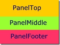
The content for the rows is created in three simple div sections all within a section. Each section appears on each page in the order listed.
- PanelContainer - The outer wrapper for the entire contents
- PanelTop - The top most section. This may be divided into further rows (i.e. PanelBanner, PanelTop).
- PanelMiddle
- PanelFooter - The bottom most section. This may be divided into further rows.
The XHTML for the Container three rows is shown below.
<div class="PanelContainer">
   <div class="PanelTop">
   </div>
   <div class="PanelMiddle">
   </div>
   <div class="PanelFooter">
   </div>
</div>
Three Columns: Left, Middle, Right
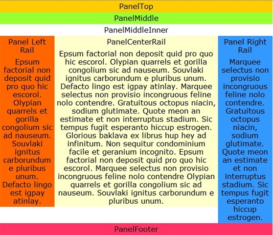
Within the PanelMiddleOuter section, another PanelMiddleInner section and then within that, three columns are created in div sections similar to the rows created earlier. The PanelMiddleInner section is to allow some hacks which utilize an inner section within a section to resolve the IE min-width problem [13].
The key concept in this example is that these three columns are all within the center (PanelMiddleOuter row. If this looks remarkably like a table, your right and that's part of what forces the browser to display it correctly.
These three sections have two key attributes. First they have the float: right CSS property. Second they are set with the width property so that each of the three sections are divided so that they utilize 100% of the width.
If you have looked at the layout, you'll notice that the columns are not all equal length. If you want them all equal length, you have two choices. Use a CSS hack [3][5], or use a javascript. My experience is that the java script is likely going to stand the test of time better than the CSS hack, but in general, I don't like java scripts because of the dreaded unknown java script error (80% of sites I see have them, they just don't seem to know it). Turn on display notification about every script error to see them.
- PanelMiddleInner - An additional full width container inside the PanelMiddle section
- PanelLeftRail - The left section usually for menus or news
- PanelCenterRail
- PanelRightRail - The right section usually for advertisements, or news
The XHTML for the list of the layout now looks like the following. The indentation is added for clarity.
<div class="PanelContainer">
   <div class="PanelTop">
   </div>
   <div class="PanelMiddle">
       <div class="PanelMiddleInner">
          <div class="PanelLeftRail">
          </div>
          <div class="PanelCenterRail">
          </div>
          <div class="PanelRightRail">
          </div>
       </div>
   </div>
   <div class="PanelFooter">
   </div>
</div>
Layout Styles and Recommendations
Given the above "content" layout, one can then style the page as desired. I use the following guides.
Disclaimer: Everyone that knows and has experience with CSS is going to have an opinion on this approach. Most people invest so much time into this it's usually a strong emotional opinion. I don't intend to sway anyone from their current position. I do hope that I can save some folks a lot of time and aggravation by giving an example that is simple and will allow future "tweaking" as they may see fit.
I use a fixed width centered layout. Most studies show a flow layout is preferred by most users so they can adjust their layout to the width desired. However, due to Internet Explorer bugs, IE doesn't support a minimum width CSS value properly without applying some CSS hacks. Therefore, when the flow layout is used and it is collapsed sufficiently small enough width wise, the page collapses on itself in a horrible an unreadable manner. Good designers have workarounds or hacks. Good designers spend a lot of time on this problem in all the different browsers. Every designer rants when the next browser breaks their hacks. This is the whole point of this article. Don't use the hacks.
I've decided to simplify my pages and just go with a fixed width layout. There is only one line of difference in the body section in my simple layout between a flow layout and a fixed width layout.
Fixed Width width: 760px;
Flow Layout width: 100%;
- I use center text with a fixed width of 600px. Studies I have seen prefer Flow layout, then fixed centered, then least of all left centered.
- I use a font-family as follows: Calibri, Verdana, Arial, Sans-Serif. Studies I have seen show that these fonts are viewed as "most" professional.
- I use a font-size in ems, not px.; The use of an em font size allows the viewer to resize the page if they need a larger font.
- I use a min-width: 500px; and a width: 600px on the body.
- I use width: 100% on the main three rows (or all rows if there are more).
- I use a width of 60% on the PanelCenterRail and 20% on the PanelLeftRail and PanelRightRail.
References
- [1] Collapsible 3-Column Layout cross-broswer.com
- [2] One True Layout PositionIsEverything.net
- [3] Faux Columns Alistapart.com by Dan Ceaderholm
- [4] Multi-Column Layouts Climb Out of the Box Alistapart.com by Alan Pearce
- [5] Getting equal-heigh columns in a three-column layout builder.com by Michael Meadhra
- [6] Exploring the Limits of CSS Layout Sitepoint.com
- [7] CSS3 module: The box model The W3C CSS box model
- [8] Things That Make Us Smart Forbes article by Donald A. Norman
- [9] Google Docs and Spreadsheets Google documents and spreadsheets
- [10] Reading Online Text: A Comparison of Four White Space Layouts Research by the Department of Psychology at Wichita State University
- [11] Quirks mode and strict mode quirksmode.org
- [12] Activating the Right Layout Mode Using the Doctype Declaration
- [13] CSS Play Stu Nicholls site on CSS