It often takes so much effort to gather data in the first place that we rarely take the time to put the data into a visual form. If we take the time to present information visually though, it can have a much greater impact on recognition, retention and comprehension.
I've written about Communication Illusions and where optical illusions can mislead.
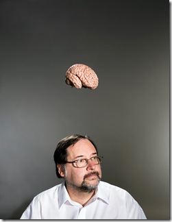
John Medina tells us about Brain Rules and vision trumps all other senses.
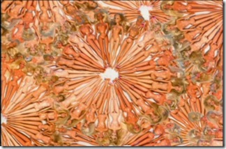
At a talk at TED, Chris Jordan talks about picturing excess. He not only takes the numbers and data and puts it into a visual form, but it takes on an artistic look and style as well.
Edward Tufte has long been considered an expert in presenting data in a visual form. I recently found out that Ben Fry has written some similar information about visualizing data.
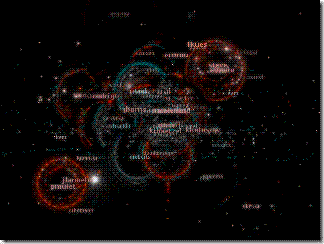
Michael Ogawa was inspired by this information visualization to create some stunning video's called code swarm that incorporate music, time, and statistics for the interactions that developers have on open source projects.
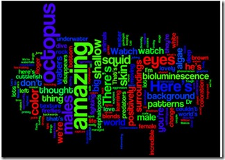
Jonathan Feinberg has created Wordle which can generate word clouds from text. Below are some images from transcripts of presentations at TED.
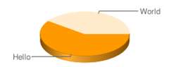
If your inclined to create your own charts and don't have Excel or a chart rendering control or tool, there's Google charts.