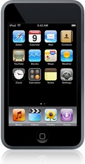
I recently did some research to see how a web based application developed for another mobile device on Windows CE 5 could be ported to the iPod Touch. The application ran initially, but showed up very small on the iPod Touch browser display. Clearly a bit of work would be needed. It wasn't as painful as some ports, but it wasn't totally pain free either.
Apple iPhone Development Center
I started by taking a look at the Apple iPhone Development Center. I didn't have an account and I didn't bother to create one so I couldn't read any documentation that Apple may have. The standard program is $99 and the enterprise program was $299. I didn't want to build an application specifically for the iPod or iPhone, I just wanted to make the web pages look and work better so I kept searching.
Detecting The iPod Browser
The application already had code to do browser sniffing, and then return a different style sheet for the mobile device than for a desktop IE or Firefox browser. We looked for a solution that would work for both the iPhone and the iPod user agents.
- iPod Touch user agent string Mozila/5.0 (iPod; U; CPU like Mac OS X; en) AppleWebKit/420.1 (KHTML, like Geckto) Version/3.0 Mobile/3A101a Safari/419.3
- iPhone user agent string Mozilla/5.0 (iPhone; U; CPU like Mac OS X; en) AppleWebKit/420+ (KHTML, like Gecko) Version/3.0 Mobile/1C28 Safari/419.3
We settled on using the string "AppleWebKit" to denote both iPod and iPhone Safari browsers and then loaded a style sheet that I could tune to the iPod specific layout later.
Setting The Viewport
The original application was developed for browsing on Windows CE with a width of 240 pixels and a height of 320 pixels (actually 294 usable pixels). This happened to be the available area after the Windows CE toolbars were shown on the bottom. After a few experiments to get the viewport settings where they would fit, I settled on the following.
<meta name="viewport" content="width=240; initial-scale=1.34; maximum-scale=5.0; user-scalable=yes;" />
After some experimentation with the iPod, I believe a new application developed specifically for the iPod would be most appropriate with a width of 480 pixels with zooming enabled.
The iPod actually has a longer usable area so that would be utilized by extending some of the scrollable regions with the iPod specific CSS.
Icon Sizes and Usability
There were basically three icon sizes used in the application. This application was actually developed and deployed a year before the first iPhone came out and long before the iPod Touch was available. After some research and UI experiments to make the CE device work well with touch and without a stylus, the following size icons were used.
- 42 x 42 pixels - used for the top bar home page and for the target size for a block with an icon combined with text.
- 36 x 36 pixels - used for most icons within the 42 x 42 icon block, or used on rows and bars.
- 32 x 32 pixels - used for the lower icons and buttons used for scrolling (up, down, next, previous).
- Icons should have a transparent background around the edges or corners.
- Apple uses 57 x 57 pixel images for icons for the home page on the iPod and iPhone.
On the iPhone, remember the viewport settings determine how large the icon shows up on the screen, so a 128 x 128 pixel icon may not be large enough to touch if the viewport is zoomed out.
These sizes were selected because of tests with users and their ability to hit the "target" area. CE devices must be calibrated from time to time and experience has shown that having too small a target surface area combined with miscalibration can lead to users thinking they are pressing one icon, when in fact the system detects another. At the least it causes confusion, but more problematic, it causes support headaches when people think the application isn't responding correctly when the hardware is out of calibration. The iPod Touch has no calibration that I can find. I assume that's a good thing.
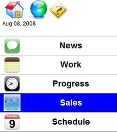
Two layout combinations were used. Rows for icons / text (about 6 rows fit on a screen) and icons in 9 grid icon layout.
When a touch surface is used instead of a mouse, the user looses the hover event. In order to provide some feedback the hover / click events we set the style with a highlighted background or alternate color background on rows or bars and icon blocks.
Scrolling
The iPod touch provides a unique feature with multi touch screen support that makes other compact mobile devices obsolete. Jeff Han demonstrated a multi-touch design at TED in February 2006. Since then, Apple and Microsoft and others have come out with displays that support multi touch, but Apple is the only one I'm aware of with multi touch support on mobile / portable small devices at this time. The multi touch surface gives two unique abilities that could not be performed on compact touch surfaces in the past.
- The ability to use two touch points to expand / collapse to zoom in and out.
- The ability to skim rapidly across the touch surface to scroll.
This opens the door to a significant limitation on mobile device layouts where space constraints limited the amount of information density on a page and scrolling used to require scroll buttons or icons on the screen which further limited the amount of available space. Usability studies with auto scrolling, start/stop scrolling all proved confusing to users. The multi-touch scrolling is very intuitive and is part of the iPod / iPhone operations system so it requires no additional coding or design on the part of the developer.
The original application designed for CE had the scroll buttons on the bottom of each page, and these should be removed for an iPhone / iPod solution since the
Address Bars
JavaScript code for scrolling the window and setting the orientation is supposed to work. It may work on the iPhone, but in the time I had, I could not get it working in the iPod touch. This does mean that the Safari address bar on the web browser shows up and must be scrolled out of the way. This would need to be resolved for a production solution, but works fine for a prototype.
JavaScript Issues
The iPod Safari browser has an option to turn on JavaScript and this application used JavaScript so it this option was turned on. Even with the option turned on, some of the JavaScript used to expand / collapse sections worked and other functions worked, but others did not. The same JavaScript worked fine in the CE environment. I didn't pursue why it didn't work.
Porting iPhone Web Apps to Other Devices
It's easier to get a full browser application working on the iPhone than on Windows CE. The main two reasons are as follows.
- The CE 5.0 IE Browser does not support .PNG images. Images must be in JPG or GIF on CE. The iPod support PNG images.
- CE 5.0 scrolling on windows requires a scroll bar (which occupies space). Removing the scroll bar through CSS requires adding in paging or scrolling through another mechanism. The iPod touch supports scrolling natively in the browser without adding in a scroll bar to occupy space on the screen.
References
- Testiphone.com
- Web Development For The iPhone - Evotech
- iPhone Web Dev
- Developing An iPhone Application - Step Change Group
- iPhone Journal - Creating the User Interface - John Frock
- iPhone Journal - JavaScript Libraries - John Frock
- iPhone Development Center - Apple
- iPhone/iPod touch Custom Icon For Your Network


