Blog
Common Layout Sizes
What size should you make your layout for a web site? Is there one layout that will fit all monitor sizes?
The basic width of a layout determines a lot of the internal layout sizes for panes, modules, images, and internal content.
Some common layout widths.
- 960 pixels, 16 columns 10+40+10 pixels each
- 960 pixels, 12 columns 10+60+10 pixels each
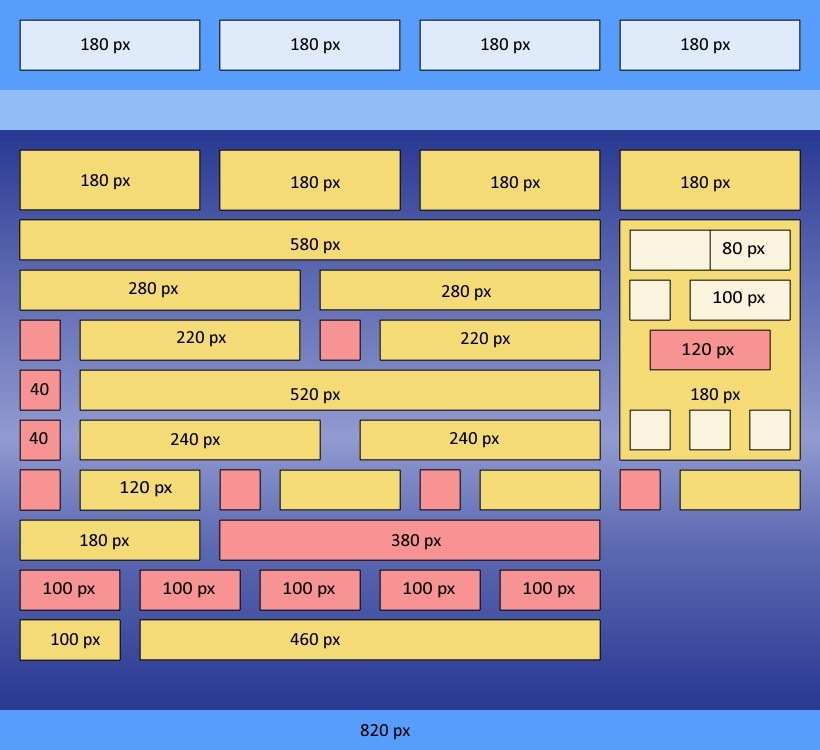
- 820 pixels, 4 columns 10+180+10 pixels each + 10 pixel margin
- 740 pixels, 12 columns 10+40+10 pixels each + 10 pixel margin
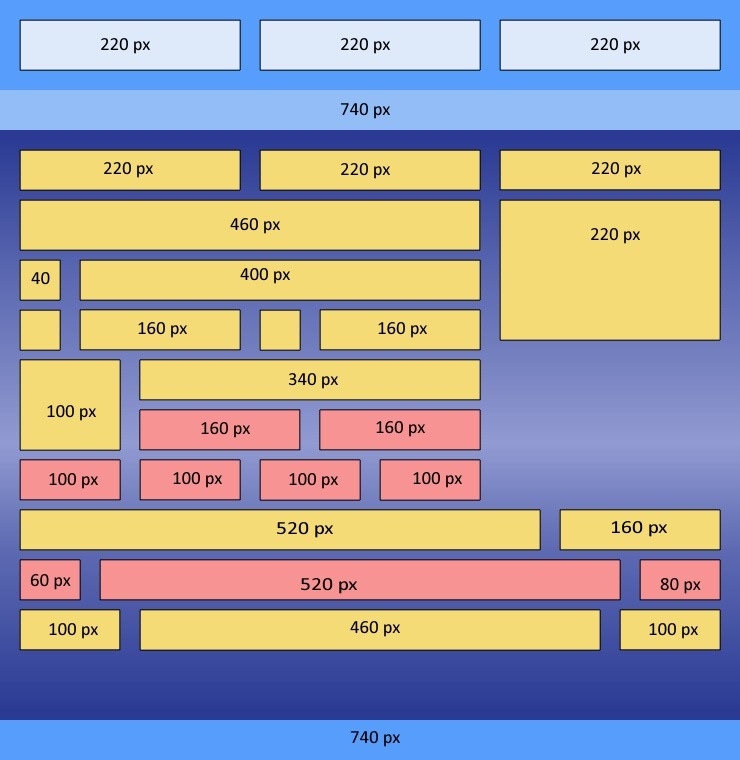
- 740 pixels, 3 columns 10+220+10 + 10 pixel margin
- 740 pixels, 4 columns 10+160+10 + 10 pixel margin
- Yahoo UI, 750 pixels, 950 pixels, 974 pixels, 100%
- Blueprint CSS - 950 pixels, 24 columns, 30+10 pixels each
All of these layouts lead to some fairly common shared sizes for panes. Any of these sizes will fit within the most common layouts.
- 520 pixels
- 460 pixels
- 240 pixels
- 180 pixels
- 120 pixels

References
Related Items
Standard Web Digital Image Sizes
What size should your photos be when posting them to the web? What are the common standard digital photo image sizes?
Every site I looked at had different size images, but some common themes did emerge. 240 x 160 pixels was a very common small format. Larger images were typically around 460 pixels wide. If you make your images larger than 460 pixels, most layouts in most blogs or site designs will have some difficulty fitting these sizes into the layout.
My Preferred Image Sizes
- Very Large 800 pixels
- Large 500 or 520 pixels
- Medium 460 pixels
- Medium-Small 320 pixels
- Small 240 pixels
- Thumbnail 100 pixels
- Square Thumb 75 pixels

Image Sizes
Video Image Sizes
- Viddler 437 x 370
- Youtube 425 x 355
Photo Image Sizes
- 1024 x 768 ratio: 1.33
- 800 x 600 ratio: 1.33
- 460 x 308 ratio: 1.49 **
- 320 x 240 ratio: 1.33 **
- 240 x 160 ratio: 1.5 **
- 220 x 148 ratio: 1.49 **
Thumbnail Image Sizes
- 160 x 160 ratio: 1 **
- 160 x 108 ratio: 1.49 **
- 160 x 120 ratio: 1.33
- 120 x 80 ratio: 1.5
- 100 x 100 ratio: 1
- 75 x 75 ratio: 1
Flickr Image Sizes
- Square 75 x 75
- Thumbnail 100 x 67
- Small 240 x 161
- Medium 500 x 334
- Large 1024 x 768
Picassa Image Sizes
Picassa Web Image Sizes
- Medium 640 x 428
- Large Thumbnail 160 x 160
- Thumbnail 144 x 96
Picassa Desktop Image Sizes
- 320
- 480
- 640
- 800
- 1024
- 1200
- 1600
Windows Live Writer Default Image Sizes
- Small 240 x 161 (128)
- Medium 640 x 428 (480)
- Large 1024 x 685 (768)
Common Photo Print Image Sizes
35mm has a ratio of 3:2 and most digital formats have a ratio of 4:3 or close.
- 2 x 3 in ratio: 1.5 (wallet)
- 3 x 5 in ratio: 1.66
- 4 x 6 in ratio: 1.5
- 5 x 7 in ratio: 1.4
- 8 x 10 in ratio: 1.25
- 10 x 13 in ratio: 1.3
- 11 x 14 in ratio: 1.27
- 16 x 20 in ratio: 1.25
- 20 x 24 in ratio: 1.2
- 24 x 36 in ratio 1.5
Common Web Image Sizes
- 1024 x 768 ratio: 1.33
- 800 x 600 ratio: 1.33
- 460 x 309 ratio: 1.49
- 320 x 240 ratio: 1.33
- 240 x 160 ratio: 1.5
- 220 x 148 ratio: 1.49
- 160 x 108 ratio: 1.49
- 160 x 120 ratio: 1.33
Amazon Image Sizes
- 120 x 150
- 120 x 240
- 120 x 90
- 180 x 150
Standard Ad Sizes
Rectangular and pop-up ads
- Large rectangle 336 x 280
- Medium rectangle 300 x 250
- Square pop-up 250 x 250
- vertical rectangle 240 x 240
- Rectangle 180 x 150
- Rectangle 300 x 100
- Rectangle 720 x 300
Banner and Buttons
- Leaderboard 728 x 90
- Full Banner 468 x 60
- Half Banner 234 x 60
- Button 1 120 x 90
- Button 2 120 x 60
- Micro bar 88 x 31
- Micro button 80 x 15
- Vertical banner 120 x 240
- Square button 125 x 125
Skyscrapers
- Skyscraper 120 x 600
- Wide skyscraper 160 x 600
- Half page 300 x 600
References
Related Items
One Layout To Bind Them All
When it comes to designing layout for on-line content, what size is the right size? How does one design for multiple screen sizes without spending duplicate effort on multiple designs. The answer depends on what size windows users are using to access the site. For me, creating a variable fixed width design based on both 960 pixels (large) or 700 pixels (medium) helps minimize duplication of design effort.
Monitor Sizes and Screen Size
The following is a list of screen sizes that are typically used. Larger monitors can set their resolution to sizes in between those listed below. Browser window sizes are usually smaller than the screen size.
- 320x240 - mobile CE device size
- 640x480
- 800x600 - typically smallest screen size in use
- 1024x768
- 1280x1024
- 1680x1050
- 2560x1024 - typically dual monitors at 1280x1024 resolution
The three most common minimum screen sizes in use in 2008 are:
- 800x600
- 1024x768
- 1280x1024
Dave Shea outlined in The Web Beyond the Desktop some of the complexities in designing for numerous screen sizes and how to use server side methods of selectively dishing up style and content.
Best Size For Design
Monitor size is not screen size. There appear to be two differing camps in approaching the size limitation for browser windows. Some argue that a fluid layout is the most desirable because as a user re-sizes their browser, the layout should resize as well (Screen Resolution and Page Layout). Others argue that a fixed size is better because it allows a designer more explicit control of the layout. I believe that users ultimately set the width of what they want to view via the browser window, not the designers and if I take that point of view, then the question for me is how much are designers willing to cooperate with what the user wants to see from a layout perspective for width and height (up to a point).
In the ideal world, a designer could specify a layout with a minimum and maximum width and let things be fluid from there. However, with the limitation of today's browsers (okay really IE) not being able to support minimum and maximum widths, it makes it difficult to support a fluid layout properly without hacks. IE is notoriously poor (i.e. IE 5, IE 6, IE 7, with IE 8 TBD) at supporting CSS min-width and max-width. Numerous people have developed several CSS hacks, but these are nonetheless hacks and when IE changes, the hacks will have to change.
It just doesn't set well with me to design a solution using hacks for 70-80% of the users that visit a site. In my experience, even the hacks don't weal with very narrow windows where the window begins to collapse and layout becomes unreadable. For this reason, I prefer a minimal fixed width design for most solutions. A fixed width allows a minimum width and a maximum width, they just happen to be the same.
Fixed Width Sizes
I've seen the concept of using grids for design before, but until I saw Nathan Smith's 960.gs images on the grids, it didn't really dawn on me the usefulness of using grids to create common layouts for multiple window sizes. More people seem to be moving toward taking advantage of a full 1024x768 size layout. But, just because their screen sizes are larger, doesn't mean that a users browser window is necessarily larger. I have a 22" monitor (actually some times I have two side by side) but I personally don't like sites to use up my screen width. I prefer to use a browser window of about 800-900 pixels. This allows me to have two windows open in parallel. I really don't prefer sites that force me to open a browser window to a full 1024 pixels wide.
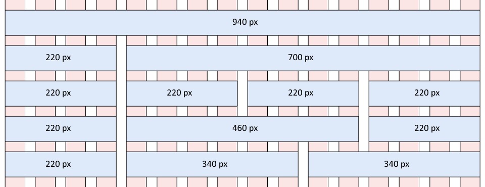
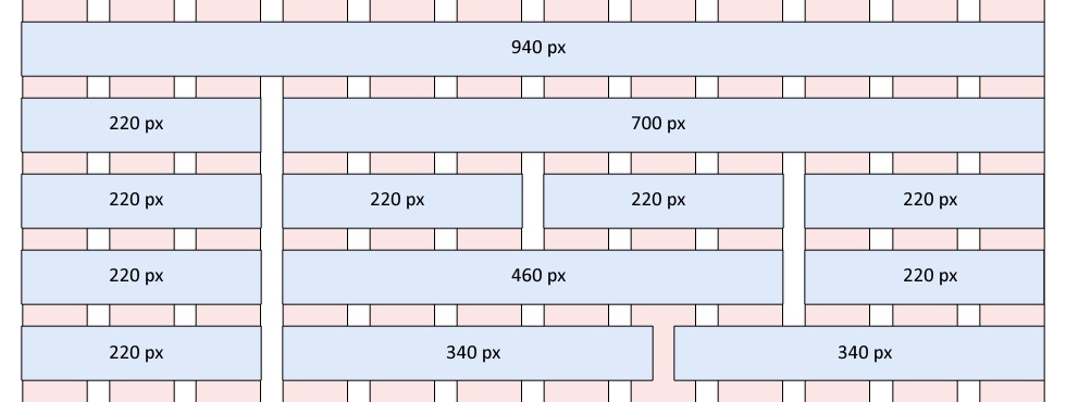
Nathan outlines in the 960 grid design a grid of using 16 columns of 40 pixel increments, or 12 columns of 60 pixel increments.
I've created some Microsoft Expression Blend templates based on Nathan Smith's 960 grid layout. The zip file of the Expression 960 grid templates can be downloaded here 960_Expression.zip (516.38 kb). Based on the spirit of Nathan's 960 grid design, these Expression templates are free for your use and licensed under GPL and MIT licenses.
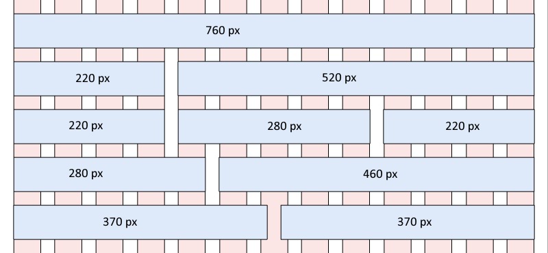
16/10 Columns
Using a margin of 10 pixels with a gutter of 20 pixels leaves a design layout with a minimum inside dimension of 940 pixels (for larger windows), or 700 pixels (for smaller windows) depending on the minimum window size. Using a grid spacing of 40 pixels, this creates a design pattern of 16 columns (large) or 10 columns (medium)
12/8 Columns
Again, using the same margin and gutter sizes above, and a using a grid spacing of 60 pixels, this creates a design pattern of 12 columns (large) or 8 columns (medium), but with the same overall dimensions for each basic column.
13 Columns
After some further review, I found that using 13 columns of 40 pixels each and a 20 pixel gutter allowed a 780 pixel wide format with an internal width of 760 pixels. While this allowed a slightly wider content, the symmetry of the 12 and 16 column layouts is in my opinion lost and this approach is less elegant in my opinion, despite have slightly more room for content.
Variable Fixed Width Sizes
Variable fixed width sizes sounds like an oxymoron. Like a 50" big screen LCD TV the size of an iPod, how do you get both variable widths and fixed widths. Richard Rutter outlined in Variable Fixed Width Layout using some different techniques to accomplish the result. The net from my perspective is:
- Use JavaScript to switch between alternate the class settings based on browser width.
- Use JavaScript to set alternate style sheets based on browser width.
- Use CSS Floats to set the "extra" columns position based on the layout.
- Use CSS to set multiple columns width based on the layout.
- Use a cookie to set the layout width.
I can't say that any one technique above would be preferred by me, but it would entirely depend on the designer's and coders decision on which technology they prefer and how they want to minimize multiple style maintenance.
Based off my experience of having to support both IE and a mobile device using the same application, the cookie combined with JavaScript and multiple style sheets when done correctly seems the most flexible, albeit a bit more maintenance.
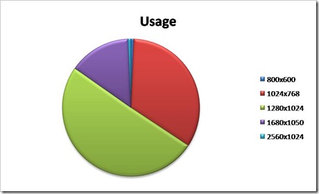
Screen Sizes In Use in 2008
As a side note, it appears to me the percentage of users using 800x600 resolution is decreasing each year. Joshua David McClurg-Genevese reports in Designing for the Web in 2004 it was 35% and in 2005 it was 28%. In 2007, browser display statistics for users at 800x600 resolution might typically be 14% of all users. The usage on this site and others I monitor indicates that typically a size of 1024x768 or larger is used to access a site with typically 800x600 in the 2-4% of overall users.
Does that mean people are buying new systems with bigger monitors or are they replacing their 800x600 monitors with bigger ones? I don't know.
Conclusions
Nathan Smith's 960 grid ultimately help me find what I was looking for, a set of common column sizes to use for design regardless of the browser width. The Variable Fixed width technique also helped me reach a decision for some size layout issues I was struggling with. The next step for me is to try a few of these techniques in some new sites to see how I like the concepts.
References
- Dynamic Resolution Dependent Layouts
- Resolution dependent layout
- Switchy McLayout
- Screen Resolution and Page Layout
- W3C CSS2.1 Length Units
- Best Screen Size For Web Design in 2008
- Designing for the Web
- The Web Beyond the Desktop
- Server side methods of selectively dishing up style and content
- WURFL - Wireless Universal Resource File
- Variable Fixed Width Layout
- CSS Drop Column Layout
- Redesign Notes 1 Width Based Layout
- A Dao of Web Design
- Body Switchers
- Style Switchers
Related Items
Adding An Account For Windows Live Writer
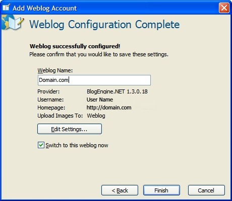
How to create a new account in Windows Live Writer for a site using BlogEngine.Net 1.3.0.18 or later.
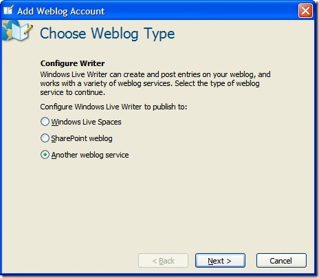
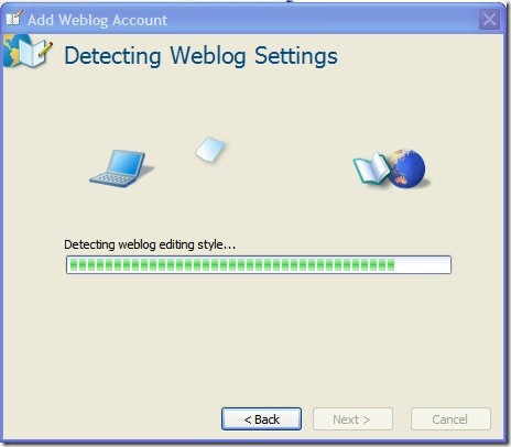
Add a new weblog account.

Select Another weblog service.
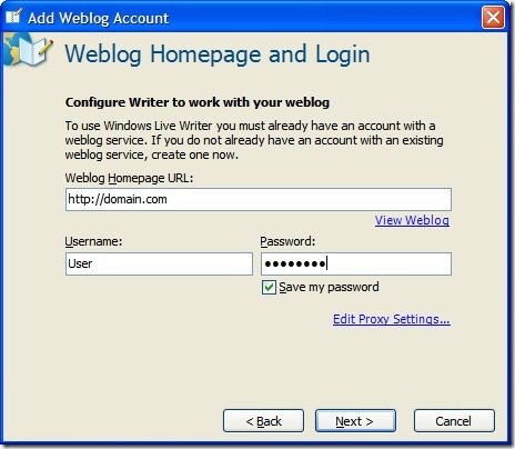
Enter the Homepage URL, username, and password.
Live Writer will detect the weblog settings (If you use another service that supports other formats, you'll be prompted what API and URL to use).
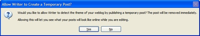
I recommend letting Live Writer detect the theme. Live Writer does not successfully delete the test post so you will have to do that manually later.
Your done.
Related Items
ASP.Net Cached XML File Settings
How to use ASP.Net Cache settings to automatically read and update values from an XML file when the file is updated, and how to lookup a value in the XML file.
.Net surprises me every day. I think about how I want to do things and then I dig a little (some time a lot) into .Net components and viola, I find it provides some new interesting functionality that I didn't know about before.
I recently wanted to implement some features for using configuration values for an ASP.NET application. My requirements were as follows.
- Implement an Admin page to allow writing / updating the configuration file.
- Use an XML file format for the configuration data.
- Cache the data in the IIS cache once read
- Update the cache if the XML file was updated
- I did not want to utilize a database
- Since these would be updated frequently, I did not want to utilize the web.config
I found the ASP.NET Cache.Insert method to be the key for my needs. By creating a Cache Dependency tied to the configuration file, when the file is updated, it will automatically update the cache. This is the same behavior as the web.config file, but without some of the same permission access issues when trying to write to the file.
I could have used a NameValueCollection to do the same thing, but I wanted to use the DataSet in this instance. I added the PrimaryKey value to the DataSet and .Net took care of the lookup of the data with Rows.Find().
Note: In order to write to an XML file via ASP.NET code, the directory must have write permissions enabled on the IIS user account (ASPNET, or Network Service, or the ID used in the application pool, or virtual directory).
The code for this particular logic was placed in the App_Code directory, so it could be accessed from code as well as ASP.NET pages via something like the following.
public static String CustomSettings(String keyValue)
{
    DataSet oDS;
    String szXMLFileName;
    String foundValue = "";
    oDS = (DataSet)System.Web.HttpContext.Current.Cache["Settings"];
    if (oDS == null)
    {
        szXMLFileName = SettingFileName();
        oDS = new DataSet();
        oDS.ReadXml(szXMLFileName);

        CacheDependency oCacheDependency;
        oCacheDependency = new CacheDependency(szXMLFileName);

        System.Web.HttpContext.Current.Cache.Insert("Settings", oDS, oCacheDependency);

    }

    DataColumn[] oKeyCols = new DataColumn[1];
    DataTable oTable;
    DataRow oRow;

    oTable = oDS.Tables["Attribute"];
    oKeyCols[0] = oTable.Columns["Key"];
    oTable.PrimaryKey = oKeyCols;
    oRow = oTable.Rows.Find((object)keyValue);
    if (oRow != null)
    {
        foundValue = (string)oRow["Value"];
    }

    return foundValue;
}
Settings.xml located in the App_Data directory
<?xml version="1.0" encoding="utf-8" standalone="yes"?>
<Configuration>
    <Attributes>
        <Attribute>
            <Key>PageTitlePrefix</Key>
            <Text>Page Title Prefix</Text>
            <Value></Value>
        </Attribute>
        <Attribute>
            <Key>PageTitleSuffix</Key>
            <Text>Page Title Suffix</Text>
            <Value> - Tim-Stanley.com</Value>
        </Attribute>
        <Attribute>
            <Key>SiteName</Key>
            <Text>Site Name</Text>
            <Value>Tim-Stanley.com</Value>
        </Attribute>
        <Attribute>
            <Key>CopyrightName</Key>
            <Text>Copyright Name</Text>
            <Value>TSI Systems LLC</Value>
        </Attribute>
    </Attributes>
</Configuration>
Related Items
Extensible CSS Interface Articles
Cameron Moll has posted some incredibly useful information on his site regarding CSS, JQuery, AJAX and extensibility in a set of articles titled The Highly Extensible CSS Interface. The information is PHP oriented, but the concepts certainly apply to ASP.NET.
Related Items
Visual Studio 2008 Hot Fix Recommended
Short on the heels of the Visual Studio 2008 release in November 2007, Microsoft released in early February a hot fix that contains several fixes. I took a bit of time before jumping on the Hot fix for production projects, but there are several IDE editing and build improvements for those using ASP.NET.
Based on the list of fixes surrounding HTML source view / HTML editing, JavaScript editing, and web site build performance, it looks very compelling to apply this fix . I've updated today and see no adverse side effects yet. The hot fix installation instructions state it can be uninstalled in the future if needed.
The information on the hot fix details and the download can be found in Scott Guthrie's post VS 2008 Web Development Hot-Fix Roll-Up Available.