Blog
Sharing Bookmarks
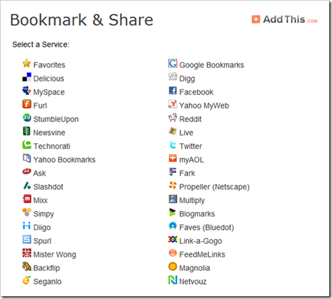
There are numerous services popping up to help you keep track of your favorite browser bookmarks. From what I can tell from Alexa traffic, the top three are Digg, Technorati, and Delicious. It seems like there are new services popping up every day and it can be hard to keep with with how to let users add your bookmarks to their bookmark service. AddThis.com looks like it's trying to help.
Add This
AddThis has a list of all the current bookmark sharing services and also keeps track of statistics of how many users add and share a specific URL.
BlogEngine.Net Bookmarks
Danny Douglass has published an extension for BlogEngine.Net at Add Social Bookmarking Links To Your Blog that adds several of the most commonly used social bookmarks.
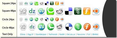
The icons from Danny's extension were from the Web 2 Icon set from FastIcon.com.

I took Danny's idea and added in links for favorites and e-mail.

Related Items
Free Photos
Where can you find some photos without paying an arm and a leg? Here are some helpful sites to try for inspiration.


Paid Photos
The following sites require some payment, but most images for the web are nominal (less than $1). The sites also offer some free photos as well.


Other Free Photo Links
Wikipedia:Public domain image resources


Visible Earth Images from NASA

Related Items
HTML And CSS Developer Tools
Despite the best developer tools, sometimes having the ability to see what the browser sees can be invaluable in troubleshooting a CSS layout issue, or a performance or load issue. Firebug, Fiddler and the IE Developer toolbar are supposed to help see the HTML, CSS and JavaScript that the browser sees.
Comparison of Firebug and the IE Toolbar features.
| Feature | Firebug | IE Toolbar / Fiddler |
|---|---|---|
| Explore DOM | yes | yes |
| View HTML object details | yes | yes |
| Validate HTML | yes | yes |
| Validate CSS | yes | yes |
| Validate WAI | yes | |
| Validate RSS | yes | |
| Display image information | yes | yes |
| Resize window to a specific resolution | yes | |
| Design Rule for measuring objects | yes | yes |
| View formatted HTML | yes | yes |
| View formatted CSS | yes | yes |
| Network performance | yes | yes |
Firebug
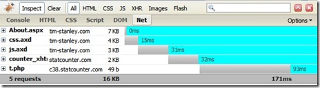
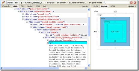
Firebug is an absolutely fantastic, must have web development tool. It saves time. It's a free download, it's a free license and it takes less than an hour to download install and have it operational.
Firebug has helped me find some interesting quirks on CSS for sites and it's invaluable. Firebug also has some Firebug extensions for other interesting features.
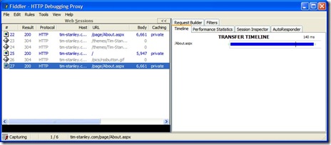
Fiddler and IE Developer Toolbar
Fiddler is a handy tool. It provides some of the same information as the NET section in Firebug. It also provides some more detailed information including the ability to hand build requests to servers and to impersonate requests as different user agents. It's complicated but appears powerful.
I've heard good things about the IE Developer Toolbar, but I've tried to install it on two systems with Windows XP with absolutely no success. From what I can tell, others have had similar problems.
After finally following the instructions at an Introduction to the Internet Explorer Developer Toolbar, I had success in installing it, but no success in getting the IE Developer Toolbar to display HTML or CSS information about pages. It's a shame, it appears to be a useful tool and there are certainly style issues on IE that are unique to IE that don't occur in Firefox.
The resize to a specific size (800x600, 1024x768) I think are very useful. I develop on a monitor that is 1680x1050 and it is nice to be able to size smaller and adjust the layouts so I know they fit smaller screens.
The ruler also appears useful (although Firebug also has one). The method of using the ruler in the IE Developer toolbar is different than the Firebug approach. Both appear to be useful.
References
Related Items
Space Between Words

There seems to be a growing trend in the web community to remove spaces between words. The fact that domain names cannot have spaces further complicates the matter.
Take a look at 20 more unfortunate domain names and you can see the kind of confusion and unanticipated consequences that occur as a result. By the way, domains can have the dash character (-) and subdomains allow the period (.) character, sometimes for interesting stylish effects (del.ico.us now delicious and script.aculo.us).
Scripta continua is the term for writing without any word separation.
I had a client who recently wanted to follow the trend and it got me wondering what was the origin of the space character in Latin based languages.
I came across references to a book by Paul Sanger Space between Words; the Origins of Silent Reading (Palo Alto, Stanford University Press, 1997).
Orest Ranum much more eloquently explains a summary of Mr. Sanger's book than I can. Roger von Oech in give me some space has his own summary of the same history.
Points I've taken away on the history of the events from what I've learned.
- Monks find text without spaces can sometimes be ambiguous
- Folks find reading without spaces a high barrier to learning
- Some monks remove spaces between words when copying text
- Some monks add spaces between words when copying text
- Reading with spaces lowers the barrier to learning
- Reading with spaces makes silent reading easier than before
- Reading with spaces makes reading faster than before.
The monks were the web designers of the day. It seems in learning how to create their illuminated manuscripts that they knew a bit about visual communication and how to make their content more usable to their audience.

I'll keep all the spaces around all my words and please don't take them away. After all, I need my space.
References
Related Items
Visual Studio 2008 SP 1 and .Net 3.5 SP 1 Released
Microsoft announced August 11 availability of the following new downloads.
Silverlight developers should also update the Silverlight Tools.
VS 2008 includes the following technologies:
- Silverlight 2 SDK Beta 2 and Tools
- MVC Preview Release #3
- ASP.NET Extensions / Dynamic Data Preview
- VC 2008 Feature Pack
- VB PowerPack Controls
- Expression Studio 2
- SQL Server 2008
- .Net Framework 3.5 SDK
- XSLT Profiler
- VISTA 2.0 SDK
- Visual Studio 2008 SDK
.Net 3.5 SP 1 includes the following features and improvements
- ASP.NET Dynamic Data
- Core CLR improvements of images, strong name verification, better startup performance and better generated code
- WPF performance improvements
- The Entity Framework
- LING to SQL support for date and file stream
- ADO.NET Data Services Framework
- WCF improvements
Update: The VS 2008 SP 1 installation package installs .Net Framework 3.5 SP 1.
Related Items
Design Layouts For Mobile Devices
After looking at Web Applications On The iPod Touch, I thought I'd share some of the patterns used in designing an application for a 320 pixel x 240 pixel Windows CE 5 device. These same design patterns and apply to designing for the iPod Touch and the iPhone as well.
Minimum Touch Sizes
The main goal was to replace the need for the mobile stylus (which was constantly getting lost, even though it was tied to the device) with a layout that worked well with just using fingers and touching the screen. In order to establish a proper size for the layout, I needed to determine what is the smallest acceptable size that worked well. I used my thumbs for these tests, figuring if I could hit the target size icons correctly with my thumbs, even users with large fingers would be able to use the device well.
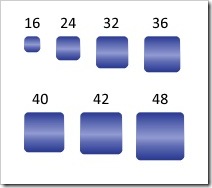
fig 1: Touch grid sizes used for testing.
After several experiments, I came to a list of acceptable sizes. The smaller sizes work well only if there is a significant amount of spacing or gutter area around the icon.
- 32 pixels by 32 pixels
- 36 pixels by 36 pixels
- 42 pixels by 42 pixels
- 48 pixels by 48 pixels
Mobile 240 Grid Designs
Nathan Smith published a 960 grid system layout. The mobile layouts were developed in 2005 long before Nathan publish his grid notes, but I believe his grid system layout helps explain the solution I used in creating layouts for the mobile device.
There are two basic column layouts that seemed to fit the available space.
- Four columns, each 40 pixels wide with a 10 pixel gutter on each side.
- Three columns, each 48 pixels wide with a 20 pixel gutter on each side.
The four column grid works well for rows of information with icons or responses on the same row. The three column grid works well for arrays of icons listed in the grid.
A Microsoft Expression 2 design template is available for download: 240 Mobile Expression Template Zip file.
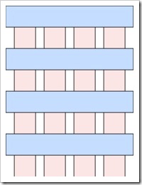
fig 2: Four Column Grid
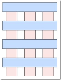
fig 3: Three Column Grid
The lower portion of the CE device display area is occupied by the status and "start" bar as well as the "keyboard" toggle icon. This leaves a usable area for design of 240 pixels wide by 284 pixels tall for the application. The iPod Touch and iPhone have a larger vertical usable area at the same viewport setting. Primarily because there is no status area on the Apple device.
After putting a header row of icons for quick access and a row of scrolling icons on the footer, that leaves room for about six icons.
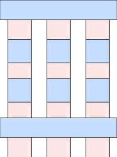
fig 4 Six icon mini grid.
The space on the windows CE device doesn't work into an even multiple of a grid and the remaining space can be utilized for date/time and breadcrumb information. The layout with six icons and the breadcrumb areas looks like figure 5.
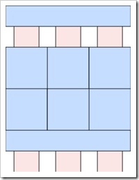
fig 5: Six icon grid.
Figure 6 shown below is similar to the header row and figure 2 with the 4 column grid and rows or bars combined with icons and text.
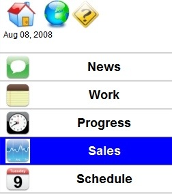
fig 6: Six Grid

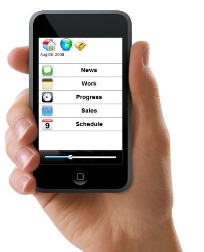
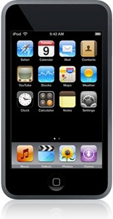
fig 7: iPod and iPhone Home Layout.
I've shown in figure 7 an screen shot of the iPhone home screen for comparison. The text label on the icon on the iPhone is extremely small. This works on the iPod Touch and the iPhone because the screen brightness and contrast ration is extremely high. The windows CE device I used had extremely low contrast and screen brightness making small text and small images difficult to read.
From a contrast / usability perspective, I much prefer the iPod Touch and iPhone over the Windows CE device. Primarily because the iPod Touch / iPhone support scrolling and zooming and the CE 5 device does not.
References
Related Items
Web Applications On The iPod Touch
I recently did some research to see how a web based application developed for another mobile device on Windows CE 5 could be ported to the iPod Touch. The application ran initially, but showed up very small on the iPod Touch browser display. Clearly a bit of work would be needed. It wasn't as painful as some ports, but it wasn't totally pain free either.
Apple iPhone Development Center
I started by taking a look at the Apple iPhone Development Center. I didn't have an account and I didn't bother to create one so I couldn't read any documentation that Apple may have. The standard program is $99 and the enterprise program was $299. I didn't want to build an application specifically for the iPod or iPhone, I just wanted to make the web pages look and work better so I kept searching.
Detecting The iPod Browser
The application already had code to do browser sniffing, and then return a different style sheet for the mobile device than for a desktop IE or Firefox browser. We looked for a solution that would work for both the iPhone and the iPod user agents.
- iPod Touch user agent string Mozila/5.0 (iPod; U; CPU like Mac OS X; en) AppleWebKit/420.1 (KHTML, like Geckto) Version/3.0 Mobile/3A101a Safari/419.3
- iPhone user agent string Mozilla/5.0 (iPhone; U; CPU like Mac OS X; en) AppleWebKit/420+ (KHTML, like Gecko) Version/3.0 Mobile/1C28 Safari/419.3
We settled on using the string "AppleWebKit" to denote both iPod and iPhone Safari browsers and then loaded a style sheet that I could tune to the iPod specific layout later.
Setting The Viewport
The original application was developed for browsing on Windows CE with a width of 240 pixels and a height of 320 pixels (actually 294 usable pixels). This happened to be the available area after the Windows CE toolbars were shown on the bottom. After a few experiments to get the viewport settings where they would fit, I settled on the following.
<meta name="viewport" content="width=240; initial-scale=1.34; maximum-scale=5.0; user-scalable=yes;" />
After some experimentation with the iPod, I believe a new application developed specifically for the iPod would be most appropriate with a width of 480 pixels with zooming enabled.
The iPod actually has a longer usable area so that would be utilized by extending some of the scrollable regions with the iPod specific CSS.
Icon Sizes and Usability
There were basically three icon sizes used in the application. This application was actually developed and deployed a year before the first iPhone came out and long before the iPod Touch was available. After some research and UI experiments to make the CE device work well with touch and without a stylus, the following size icons were used.
- 42 x 42 pixels - used for the top bar home page and for the target size for a block with an icon combined with text.
- 36 x 36 pixels - used for most icons within the 42 x 42 icon block, or used on rows and bars.
- 32 x 32 pixels - used for the lower icons and buttons used for scrolling (up, down, next, previous).
- Icons should have a transparent background around the edges or corners.
- Apple uses 57 x 57 pixel images for icons for the home page on the iPod and iPhone.
On the iPhone, remember the viewport settings determine how large the icon shows up on the screen, so a 128 x 128 pixel icon may not be large enough to touch if the viewport is zoomed out.
These sizes were selected because of tests with users and their ability to hit the "target" area. CE devices must be calibrated from time to time and experience has shown that having too small a target surface area combined with miscalibration can lead to users thinking they are pressing one icon, when in fact the system detects another. At the least it causes confusion, but more problematic, it causes support headaches when people think the application isn't responding correctly when the hardware is out of calibration. The iPod Touch has no calibration that I can find. I assume that's a good thing.
Two layout combinations were used. Rows for icons / text (about 6 rows fit on a screen) and icons in 9 grid icon layout.
When a touch surface is used instead of a mouse, the user looses the hover event. In order to provide some feedback the hover / click events we set the style with a highlighted background or alternate color background on rows or bars and icon blocks.

Scrolling
The iPod touch provides a unique feature with multi touch screen support that makes other compact mobile devices obsolete. Jeff Han demonstrated a multi-touch design at TED in February 2006. Since then, Apple and Microsoft and others have come out with displays that support multi touch, but Apple is the only one I'm aware of with multi touch support on mobile / portable small devices at this time. The multi touch surface gives two unique abilities that could not be performed on compact touch surfaces in the past.
- The ability to use two touch points to expand / collapse to zoom in and out.
- The ability to skim rapidly across the touch surface to scroll.
This opens the door to a significant limitation on mobile device layouts where space constraints limited the amount of information density on a page and scrolling used to require scroll buttons or icons on the screen which further limited the amount of available space. Usability studies with auto scrolling, start/stop scrolling all proved confusing to users. The multi-touch scrolling is very intuitive and is part of the iPod / iPhone operations system so it requires no additional coding or design on the part of the developer.
The original application designed for CE had the scroll buttons on the bottom of each page, and these should be removed for an iPhone / iPod solution since the
Address Bars
JavaScript code for scrolling the window and setting the orientation is supposed to work. It may work on the iPhone, but in the time I had, I could not get it working in the iPod touch. This does mean that the Safari address bar on the web browser shows up and must be scrolled out of the way. This would need to be resolved for a production solution, but works fine for a prototype.
JavaScript Issues
The iPod Safari browser has an option to turn on JavaScript and this application used JavaScript so it this option was turned on. Even with the option turned on, some of the JavaScript used to expand / collapse sections worked and other functions worked, but others did not. The same JavaScript worked fine in the CE environment. I didn't pursue why it didn't work.
Porting iPhone Web Apps to Other Devices
It's easier to get a full browser application working on the iPhone than on Windows CE. The main two reasons are as follows.
- The CE 5.0 IE Browser does not support .PNG images. Images must be in JPG or GIF on CE. The iPod support PNG images.
- CE 5.0 scrolling on windows requires a scroll bar (which occupies space). Removing the scroll bar through CSS requires adding in paging or scrolling through another mechanism. The iPod touch supports scrolling natively in the browser without adding in a scroll bar to occupy space on the screen.
References
- Testiphone.com
- Web Development For The iPhone - Evotech
- iPhone Web Dev
- Developing An iPhone Application - Step Change Group
- iPhone Journal - Creating the User Interface - John Frock
- iPhone Journal - JavaScript Libraries - John Frock
- iPhone Development Center - Apple
- iPhone/iPod touch Custom Icon For Your Network